The other day I was sitting next to a classmate. Together, we were reading their typed document when I couldn’t help but notice their preposterous font choice: Calibri. When I pointed this out, they sang its praises, describing how much they loved the sans-serif font with its minimalist nature and “clean” feeling. It just so happened that I couldn’t disagree more. Nonetheless, I respect and share the passion for fonts.
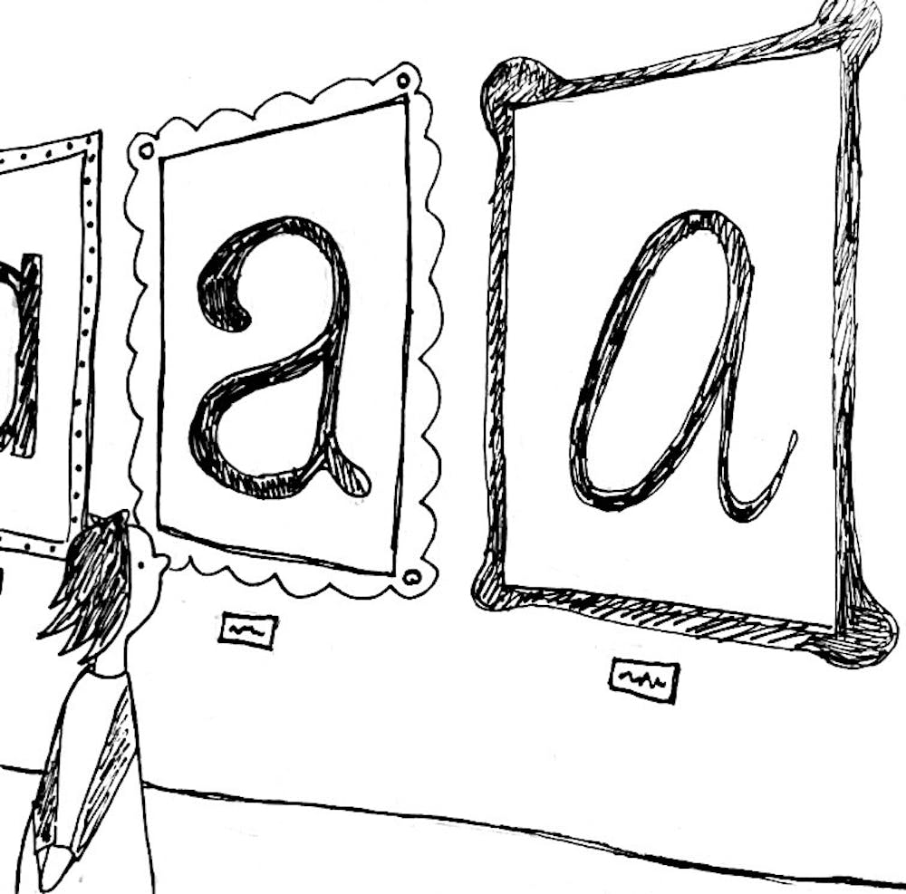
Fonts are so important. As students, artists and people, we put so much time into creating our work, but sometimes write off the importance of the delivery — the font that others use to read it. Fonts are key to visual storytelling. They elicit emotion and sentiments about your text and stories. They influence how a reader interacts with the page and, consequently, the content. You wouldn’t use Comic Sans for a legal brief! That would just be silly.
To be honest, I talk a lot about fonts. Over these past few years, I have worked with Middlebury Geographic as a layout design editor, and, let me tell you, we talk fonts. They are crucial to curating the right “vibe” for each piece and, therefore, enhance our storytelling ability.
If you don’t think that font is important or influential, please explain the early 2000s Microsoft WordArt obsession to me. Try.
Microsoft WordArt literally took over our generation. As a child in 2009, I had printed copies of my name in various WordArt forms, just for my enjoyment. Not even to do anything with. This incident is not unique to me — everyone I knew around my age was obsessed with WordArt. This is for good reason: WordArt rocks!
In other words, font is art. And it’s really important! A good friend of mine said the most ridiculous thing about fonts the other morning. I was creating a logo, of which font is obviously of the utmost importance, but I couldn’t find the exact one I desired on Photoshop. He remarked: “Just make it all caps, then the font won’t matter.” As if! Font so matters!
On a more serious note, fonts are important as a means of accessibility. Aspects of font like its serif, size, boldness and overall legibility are highly influential when it comes to how people engage with it. Fonts like Calibri, Arial and Times New Roman are widely available and well-known for their accessibility. Font choice matters to tell your story in a visual manner that everyone can enjoy.
So, as a self-declared expert of fonts and their associated vibes, I’m going to give y’all my unsolicited opinion on several fonts. For context, as I describe these fonts, sans-serif fonts like Calibri or Arial do not have the little extensions on the ends of the letters, while Times New Roman and Garamond have serifs. Sans-serif fonts are regarded as more modern while serif fonts are a bit more traditional. For full transparency, my opinion is informed as someone who prefers a font with serif.
Complete disclaimer: I formed my opinions on these fonts immediately after typing out their names while writing this op-ed, and my opinions are subject to change, even as I edit this. In fact, I encourage fluid font opinions — our feelings and styles of art (and, therefore, fonts) are ever-evolving as we grow, learn and change. (My opinions on fonts are also not indicative of my opinions on the person who uses the font, I love everyone and their font choice ). ((I also have no real merit in making any judgments on font choice)).
Arial: Default. It’s okay. Very plain. Not exciting. Or cool at all. But legible.
Calibri: Weird choice, but okay. Calibri feels like the younger sibling of Arial. It’s a little more hip and happening. But, not my favorite (I prefer fonts with serifs if I’m typing something academic). I respect all my peers who admire Calibri and hope that everyone becomes as passionate about their choice of font.
Times New Roman: Professional. Academic. Respectable. But you definitely only use Times New Roman because all your professors want you to. Break free!
Lato: I have never known anyone to use this. But, honestly, I kinda like it. If you don’t like serifs, I would choose this any day over Arial or Calibri. It is, however, peculiar. I can’t quite decide what I find so silly about it, but there is an air of fun with Lato. A type of fun that perhaps is better for making a poster than typing your research paper.
Georgia: I also have never really seen anyone use this. I think I like it… (Edit: I have since been informed that the Campus prints in Georgia. So I have seen this before, and now I like it even more).
Comic sans: Unacceptable! Unless it is used in an ironic manner — I typically find that funny. But Comic Sans used seriously is never cool! Even if you’re making a document for children. Comic Sans does not look friendly in my opinion, and I bet a kid would rather read a document written in Lato.
Playfair Display: I have used this before in communications notes. It’s pretty compressed. I feel like I would have liked this font a couple of years ago, as it kind of resembles my handwriting from that time. But now, it’s just not for me. I have grown out of Playfair Display and my current handwriting is significantly worse.
Roboto: Sans-serif…interesting. I actually think this could maybe take the spot as my favorite sans-serif font (Until I am proven otherwise). Typing with Roboto makes me feel like I am an AI chatbot. It shakes things up. It makes me feel like I would be better at data analysis while writing in this font.
If you were wondering, my font of choice is Garamond. Obviously. Garamond is professional yet flirty. It has a great serif. It reads well. It looks fun. It’s hot. I set it as my default. Obviously.
All this goes to say that font choice is incredibly important in its ability to convey our work effectively and with purpose to others. I encourage you all to consider what role your font could have when it’s utilized in your pieces of work. We all put so much effort into what we create, so it is important to use a font that can enhance your creations. And, it’s fun.

Libby Scaperotta ’24 (she/her) is the Opinions Senior Editor.
Libby is an Environmental Policy major and Geography minor. She enjoys photography, travel, and spending time outside with friends. Libby also works as a layout design editor for Middlebury Geographic.

